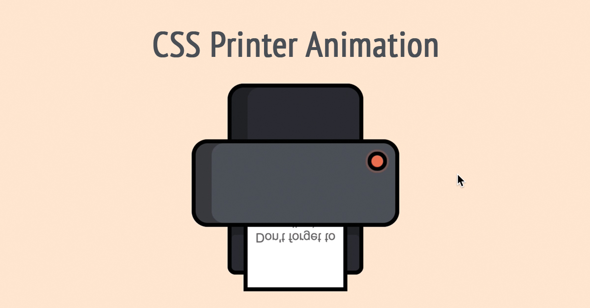
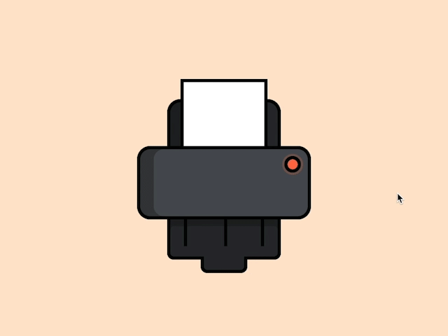
To learn how to create the CSS Printer Animation follow the steps below and watch the video tutorial.
Demo:
*to see the animation on the website click here.
Step1.
Add HTML
<div id="printer-animation" class="printer-animation">
  <div class="printer">
  <input id="button" type="checkbox">
    <label class="button" for="button"></label>
    <div class="top"></div>
    <div class="middle"></div>
    <div class="trace"></div>
    <div class="paper">
    </div>
  </div>
  </div>
Step2.
Add CSS
Set the colour and the position of the background and elements:
body {
  display: flex;
  height: 100vh;
  align-items: center;
  justify-content: center;
  background-color: #ffe5cc;
}

input#button {
  display: none;
}

.printer-animation, .printer {
  position: relative;
  top:-35px;
}
Style the printer:
.top {
  position: absolute;
  background-color: #282c30;
  width: 160px;
  height:70px;
  border-radius: 20px 20px 0 0;
  border:5px solid black;
  transform: translate(-50%,-50%);
  left: 50%;
  top: 50%;
  box-shadow: inset 20px 0 #1e2124;
  z-index:-1;
}

.middle {
  position: absolute;
  background-color: #4a4f55;
  border: 5px solid black;
  width: 250px;
  height:100px;
  border-radius: 20px;
  top:30px;
  left:-130px;
  box-shadow: inset 20px 0 #373b3d;
  z-index:5;
}

.trace, .trace:before {
  position: absolute;
  background-color: #282c30;
}

.trace {
  border:5px solid black;
  width: 160px;
  height: 80px;
  border-radius: 10px;
  left:-85px;
  top:110px;
  box-shadow: inset 0 35px #1e2124;
  z-index:2;
}

.trace:before {
  content:"";
  width: 60px;
  height: 20px;
  border-radius: 0 0 10px 10px;
  top:80px;
  left:45px;
  border-bottom: 5px solid black;
  border-right: 5px solid black;
  border-left: 5px solid black;
}

.trace:after {
  position: absolute;
  content:"";
  width: 5px;
  height: 50px;
  background-color: black;
  left: 20px;
  top:15px;
  box-shadow: 60px 0 black, 115px 0 black;
}

.paper {
  position: absolute;
  border: 5px solid black;
  background-color: white;
  width:120px;
  height: 140px;
  top:-70px;
  left: -65px;
  z-index:3;
}

.button {
  position: absolute;
  z-index:30;
  border-radius: 50%;
  border: 5px solid black;
  background-color: #fd6e49;
  width:15px;
  height: 15px;
  left: 90px;
  cursor: pointer;
  top:45px;
  animation: pulse 1.5s infinite;
}

.button:active {
  background-color: #52dc97;
}

.button:hover {
  animation: none;
}

.paper:before {
  content:"Don't forget to smile :)";
  position: absolute;
  font-family: arial;
  text-align: center;
  top: 50px;
  transform: scaleY(-1);
  opacity:0;
}
Animate the button and the paper:
input#button:checked ~ .paper {
  animation: print 2.2s linear forwards;
}

input#button:checked ~ .paper:before {
  animation: display 2.2s linear forwards;
}

@keyframes print {
  0% {transform: translateY(0);z-index:3;}
  50% {transform: translateY(200px);z-index:3;}
  79% {transform: translateY(200px);z-index:3;}
  90% {transform: translateY(200px) rotateX(-90deg);z-index:3;}
  95% {transform: translateY(50px) scale(2);z-index:50;}
  100% {transform: translateY(50px) scale(2);z-index:50;}
}

@keyframes display {
  0% {opacity:0; transform: scaleY(-1);}
  28% {opacity:0; transform: scaleY(-1);}
  40% {opacity:1; transform: scaleY(-1);}
  80% {opacity:1; transform: scaleY(-1);}
  95% {opacity:1; transform: scaleY(1);}
  100% {opacity:1; transform: scaleY(1);}
}

@keyframes pulse {
  0% {
    transform:scale(.9);
  }
  70% {
    transform: scale(1);
    box-shadow: 0 0 0 3px rgba(253, 110, 73,.3);
  }
    100% {
    transform: scale(.9);
    box-shadow: 0 0 0 0 rgba(253, 110, 73,.3);
  }
}
Step3. (optional)
Add jQuery
To repeat the animation on double click add jQuery:
To read how to add the jQuery code to HTML click here.
$(document).ready(function(){
  $('#printer-animation').mouseleave(function(){
    $(this).removeClass('clicked');
  }).dblclick(function(){
    $(this).addClass('clicked').html($(this).html());
  });
});
Watch also the video tutorial:
Enjoy coding!
Hey, here’s something that might interest you:


