
You can make “rounded corners” of the element/ image by adding a CSS border-radius property:
<!doctype html>
<html>
<head>
<title></title>
<style>
.square {
      width: 100px;
      height: 100px;
      background-color: red;
      border-radius:25px;
	}
</style>
</head>

<body>
	<div class="square"></div>
</body>
</html>
Output:

You can also apply a different radius to each corner of your element:
<!doctype html>
<html>
<head>
<title></title>
	<style>
.square {
	width: 100px;
	height: 100px;
	background-color: red;
	border-radius:25px 70px 30px 50px; /* top left, top right, bottom right, bottom left
	}
	</style>
</head>

<body>
	<div class="square"></div>
</body>
</html>
Output:

Note: The value of the border-radius from the example above:
border-radius:25px 70px 30px 50px; /* top left, top right, bottom right, bottom leftis a shorthand of the values below:
border-top-left-radius: 25px;
border-top-right-radius: 70px;
border-bottom-right-radius: 30px;
border-bottom-left-radius: 50px;
The radius does not need to be always a circle can be also more elliptical. Add the slash (“/”) between values:
<!doctype html>
<html>
<head>
<title></title>
<style>
         .square {
		width: 100px;
		height: 100px;
		background-color: red;
		border-radius:25px/50px;
		}
</style>
</head>

<body>
	<div class="square"></div>
</body>
</html>
Output:

By using this method you can create some advanced CSS shapes of elements without using SVG:
CSS DROP/ DROPLET SHAPE
<!doctype html>
<html>
<head>
<title></title>
<style>
	.droplet {
            position: absolute;
            width:100px;
            height: 100px;
            border-radius: 80% 0 55% 50% / 55% 0 80% 50%;
            background-color: lightblue;
	    transform: rotate(-45deg);
		}
	</style>
</head>

<body>
	<div class="droplet"></div>
</body>
</html>
Output:

CSS LEMON SHAPE
<!doctype html>
<html>
<head>
<title></title>
<style>
		.lemon {
	    position: absolute;
            width:100px;
            height: 100px;
            border-radius: 10px 130px 30px 130px;
            background-color: yellow;
		}
</style>
</head>

<body>
	<div class="lemon"></div>
</body>
</html>
Output:

CSS LEAF SHAPE
<!doctype html>
<html>
<head>
<title></title>
<style>
		.leaf {
	    position: absolute;
            width:100px;
            height: 100px;
            border-radius:100% 0;
            background-color: green;
		}
</style>
</head>

<body>
	<div class="leaf"></div>
</body>
</html>
CSS EGG SHAPE
<!doctype html>
<html>
<head>
<title></title>
<style>
	.egg {
	    position: absolute;
            width:100px;
            height: 140px;
            border-radius: 50% 50% 50% 50% / 60% 60% 40% 40%;
            background-color: beige;
		}
</style>
</head>

<body>
	<div class="egg"></div>
</body>
</html>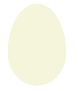
Enjoy coding!
Read also:
CSS Egg Shape and CSS Easter eggs