The CSS border-image-repeat property defines whether the border-image should be repeated, rounded or stretched.
Demo:
Syntax:
border-image-repeat: stretch|repeat|round|space;
stretch (default) – the image is stretched to fill the area.
repeat – the image is repeated to fill the area.
round – the image is repeated to fill the area (if it does not fill the area with a whole number of tiles, the image is rescaled so it fits).
space – the image is repeated to fill the area (if it does not fill the area with a whole number of tiles, the extra space is distributed around the tiles).
Example:
<!DOCTYPE html>
<html>
<head>
<style>
#borderimg-1 {
  border: 15px solid transparent;
  padding: 15px;
  border-image-source: url(https://lenadesign.org/wp-content/uploads/2021/09/border-1.png);
  border-image-repeat: repeat;
  border-image-slice: 30;
}

#borderimg-2 {
  border: 15px solid transparent;
  padding: 15px;
  border-image-source: url(https://lenadesign.org/wp-content/uploads/2021/09/border-1.png);
  border-image-repeat: round;
  border-image-slice: 30;
}

#borderimg-3 {
  border: 15px solid transparent;
  padding: 15px;
  border-image-source: url(https://lenadesign.org/wp-content/uploads/2021/09/border-1.png);
  border-image-repeat: stretch;
  border-image-slice: 30;
}
</style>
</head>
<body>

<h4>border-image-repeat: repeat;</h4>
<p id="borderimg-1">Here, the image tiles to fill the area. Tiles are divided if necessary.</p>

<h4>border-image-repeat: round;</h4>
<p id="borderimg-2">Here, the image tiles to fill the area. The image is rescaled if necessary, to avoid dividing tiles.</p>

<h4>border-image-repeat: stretch;</h4>
<p id="borderimg-3">Here, the image is stretched to fill the area.</p>

</body>
</html>
Output:
border-image-repeat: repeat;
Here, the image tiles to fill the area. Tiles are divided if necessary.
border-image-repeat: round;
Here, the image tiles to fill the area. The image is rescaled if necessary, to avoid dividing tiles.
<!DOCTYPE html>
<html>
<head>
<style>
h4 {
  border-bottom: 5px dotted red;
}

p {
  border-bottom: 4px dashed blue;
}

div {
  border-bottom: solid;
}
</style>
</head>
<body>

<h4>A heading with a dotted red bottom border.</h4>
<p>A paragraph with a dashed blue bottom border.</p>
<div>A div element with a solid bottom border.</div>

</body>
</html>
The CSS border-bottom-width property settles the width of an element’s bottom border.
Demo:
Syntax:
border-bottom-width: medium|thin|thick|length;
medium (default) – defines a medium bottom border.
thin – defines a thin bottom border.
thick – defines a thick bottom border.
length – allows you to specify the thickness of the bottom border (CSS Units).
Example1:
Set the width of the bottom border to medium:
<!DOCTYPE html>
<html>
<head>
<style>
p {
  border-bottom-style: solid;
  border-bottom-width: medium;
}

div {
  border-style: solid;
  border-bottom-width: medium;
}
</style>
</head>
<body>

<p>A paragraph with a medium bottom border.</p>

<div>A div element with a medium bottom border.</div>

</body>
</html>
Output:
A paragraph with a medium bottom border.
A div element with a medium bottom border.
Example2:
Set the width of the bottom border to 5px:
<!DOCTYPE html>
<html>
<head>
<style>
p {
  border-bottom-style: solid;
  border-bottom-width: 5px;
}

div {
  border-style: solid;
  border-bottom-width: 5px;
}
</style>
</head>
<body>

<p>A paragraph with a 5px thick bottom border.</p>

<div>A div element with a 5px thick bottom border.</div>

</body>
</html>
<!DOCTYPE html>
<html>
<head>
<style>
div {
  border-bottom-style: dotted;
}

p {
  border-style: solid;
  border-bottom-style: dotted;
}
</style>
</head>
<body>

<div>A div element with a dotted bottom border</div>

<p>A paragraph with a dotted bottom border.</p>

</body>
</html>
Output:
A div element with a dottoed bottom border
A paragraph with a dotted bottom border.
Example2:
A double bottom border:
<!DOCTYPE html>
<html>
<head>
<style>
div {
  border-bottom-style: double;
}

p {
  border-style: solid;
  border-bottom-style: double;
}
</style>
</head>
<body>

<div>A div element with a double bottom border</div>

<p>A paragraph with a double bottom border.</p>

</body>
</html>
The CSS border-bottom-right-radius property specifies the radius of the bottom right corner.
Demo:
Click the button to change the border-bottom-right-radius property (50px) of the DIV element:
Hello
Syntax:
border-bottom-right-radius: length;
length – specifies the shape of the bottom-left corner (px/%).
Example:
<!DOCTYPE html>
<html>
<head>
<style>
#example1 {
  border: 3px solid #2a9d8f;
  padding: 10px;
  border-bottom-right-radius: 25px;
}

#example2 {
  border: 3px solid #2a9d8f;
  padding: 10px;
  border-bottom-right-radius: 50px 20px;
}

#example3 {
  border: 3px solid #2a9d8f;
  padding: 10px;
  border-bottom-right-radius: 50%;
}
</style>
</head>
<body>

<h4>border-bottom-right-radius: 25px;</h4>
<div id="example1">
  <p>The border-bottom-right-radius property defines the radius of the bottom-right corner.</p>
</div>

<h4>border-bottom-right-radius: 50px 20px;</h4>
<div id="example2">
  <p>If two values are set; the first one is for the bottom border, the second one for the right border.</p>
</div>

<h4>border-bottom-right-radius: 50%;</h4>
<div id="example3">
  <p>The CSS border-bottom-right-radius property is set to 50%.</p>
</div>

</body>
</html>
Output:
border-bottom-right-radius: 25px;
The border-bottom-right-radius property defines the radius of the bottom-right corner.
border-bottom-right-radius: 50px 20px;
If two values are set; the first one is for the bottom border, the second one for the right border.
border-bottom-right-radius: 50%;
The CSS border-bottom-right-radius property is set to 50%.
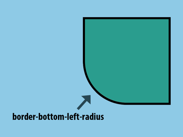
The CSS border-bottom-left-radius property specifies the radius of the bottom-left corner.
Demo:
Click the button to change the border-bottom-left-radius property (50px) of the DIV element:
Hello
Syntax:
border-bottom-left-radius: length;
length – specifies the shape of the bottom-left corner (px/%).
Example:
<!DOCTYPE html>
<html>
<head>
<style>
#example1 {
  border: 3px solid #2a9d8f;
  padding: 10px;
  border-bottom-left-radius: 25px;
}

#example2 {
  border: 3px solid #2a9d8f;
  padding: 10px;
  border-bottom-left-radius: 50px 20px;
}

#example3 {
  border: 3px solid #2a9d8f;
  padding: 10px;
  border-bottom-left-radius: 50%;
}
</style>
</head>
<body>

<h4>border-bottom-left-radius: 25px;</h4>
<div id="example1">
  <p>The border-bottom-left-radius property defines the radius of the bottom-left corner.</p>
</div>

<h4>border-bottom-left-radius: 50px 20px;</h4>
<div id="example2">
  <p>If two values are set; the first one is for the bottom border, the second one for the left border.</p>
</div>

<h4>border-bottom-left-radius: 50%;</h4>
<div id="example3">
  <p>The CSS border-bottom-left-radius property is set to 50%.</p>
</div>

</body>
</html>
Output:
border-bottom-left-radius: 25px;
The border-bottom-left-radius property defines the radius of the bottom-left corner.
border-bottom-left-radius: 50px 20px;
If two values are set; the first one is for the bottom border, the second one for the left border.
border-bottom-left-radius: 50%;
The CSS border-bottom-left-radius property is set to 50%.