CSS responsive web design makes your website look good on small devices (like tablets, or mobile phones).
When you use CSS and HTML to resize, hide, stack, shrink, or move the content to make it look good on smaller screens, it is a responsive design.
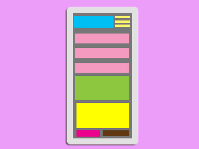
Example:
To create the example above follow the steps below:
Step1.
Add HTML
Include the following <meta> viewport element in your website code:
<!DOCTYPE html>
<html>
<head>
<meta name="viewport" content="width=device-width, initial-scale=1.0">
</head>
<body>

<div class="header">
  <h1>Fashion Store</h1>
</div>

<div class="row">
  <div class="col-3 col-s-3 menu">
    <ul>
      <li>Jackets</li>
      <li>Shoes</li>
      <li>Bags</li>
      <li>Dresses</li>
    </ul>
  </div>

  <div class="col-6 col-s-9">
    <h1>New In</h1>
    <p>Discover all the new arrivals of the women's ready-to-wear collection Fall-Winter 2021. Browse items that you need for your store: dresses, shoes, bags...</p>
  </div>

  <div class="col-3 col-s-12">
    <div class="aside">
      <h2>About Us</h2>
      <p>Our clothing and accessories are carefully curated to provide our customers the latest fashions.</p>
      <h2>Shipping</h2>
      <p>Worldwide Shipping.</p>
      <h2>Privacy & Cookies</h2>
      <p>When you visit our website, our web server collects some basic information such as your internet service provider's domain name...</p>
    </div>
  </div>
</div>

<div class="footer">
  <p>Resize the browser window to see the resizing effect.</p>
</div>

</body>
</html>
Step2.
Add CSS
Add the CSS @media rule to apply different styles for different media types/devices:
<style>
body {
  margin:0;
  padding:0;
}

* {
  box-sizing: border-box;
}

.row::after {
  content: "";
  clear: both;
  display: table;
}

[class*="col-"] {
  float: left;
  padding: 15px;
}

html {
  font-family: tahoma;
}

.header {
  background-color: #0a9396;
  color: #ffffff;
  padding: 15px;
}

.menu ul {
  list-style-type: none;
  margin: 0;
  padding: 0;
}

.menu li {
  padding: 8px;
  margin-bottom: 7px;
  background-color: #005f73;
  color: #ffffff;
  box-shadow: 0 1px 3px rgba(0,0,0,0.12), 0 1px 2px rgba(0,0,0,0.24);
}

.menu li:hover {
  background-color: #0a9396;
}

.aside {
  background-color: #005f73;
  padding: 15px;
  color: #ffffff;
  text-align: center;
  font-size: 14px;
  box-shadow: 0 1px 3px rgba(0,0,0,0.12), 0 1px 2px rgba(0,0,0,0.24);
}

.footer {
  background-color: #001219;
  color: #ffffff;
  text-align: center;
  font-size: 12px;
  padding: 15px;
}

/* For mobile phones: */
[class*="col-"] {
  width: 100%;
}

@media only screen and (min-width: 600px) {
  /* tablets: */
  .col-s-1 {width: 8.33%;}
  .col-s-2 {width: 16.66%;}
  .col-s-3 {width: 25%;}
  .col-s-4 {width: 33.33%;}
  .col-s-5 {width: 41.66%;}
  .col-s-6 {width: 50%;}
  .col-s-7 {width: 58.33%;}
  .col-s-8 {width: 66.66%;}
  .col-s-9 {width: 75%;}
  .col-s-10 {width: 83.33%;}
  .col-s-11 {width: 91.66%;}
  .col-s-12 {width: 100%;}
}
@media only screen and (min-width: 768px) {
  /* desktop: */
  .col-1 {width: 8.33%;}
  .col-2 {width: 16.66%;}
  .col-3 {width: 25%;}
  .col-4 {width: 33.33%;}
  .col-5 {width: 41.66%;}
  .col-6 {width: 50%;}
  .col-7 {width: 58.33%;}
  .col-8 {width: 66.66%;}
  .col-9 {width: 75%;}
  .col-10 {width: 83.33%;}
  .col-11 {width: 91.66%;}
  .col-12 {width: 100%;}
}
</style>
Enjoy coding!
Read also: