To create the CSS Rainbow border/ button Animation follow the steps below and watch the video tutorial.
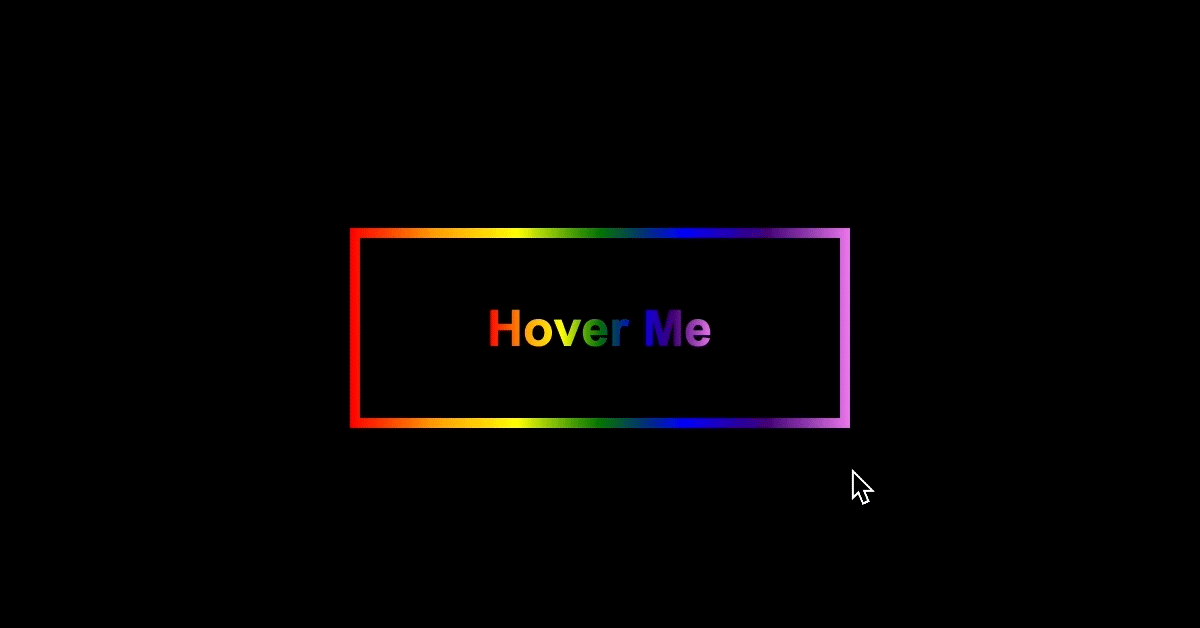
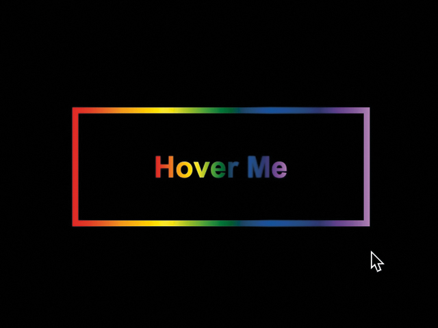
Demo:
*to see the animation on the website click here.
Step1.
Add HTML
<div class="button"></div>Step2.
Add CSS
Set the colour and the position of the background and elements:
body {
  display: flex;
  align-items: center;
  justify-content: center;
  height: 100vh;
  background-color: black;
}
Create the border and style the text:
.button {
  position: relative;
  width: 250px;
  height:100px;
  background-image:
    linear-gradient(to right, red,orange,yellow,green,blue,indigo,violet);
  cursor: pointer;
}

.button:before {
  content:"";
  position: absolute;
  width: 240px;
  height: 90px;
  background-color: black;
  top:5px;
  left:5px;
}

.button:after {
  content:"Hover Me";
  position: absolute;
  transform: translate(-50%,-50%);
  top:50%;
  left:50%;
  font-family: arial;
  font-weight: 900;
  font-size: 25px;
  background-image:
    linear-gradient(to right, red,orange,yellow,green,blue,indigo,violet);
  -webkit-background-clip: text;
  -webkit-text-fill-color: transparent;
}
Animate the text and the border on hover:
@keyframes move {
	to {
		background-position: 2500vh;
	}
}

.button:hover {
  animation: move 30s linear infinite;
}

.button:hover:after {
  animation: move 29s linear infinite;
}
Watch also the video tutorial:
Enjoy coding!
Hey, here’s something that might interest you: