Demo:
To create the CSS Window Rain (Blind Open/Close) animation follow the steps below and watch the video tutorial.
- Add HTML
- Add CSS
Step1.
Add HTML
<div class="window">
  <div class="content">
    <div class="shine"></div>
    <div class="rain">
      <div class="dropletOne"></div>
      <div class="dropletTwo"></div>
      <div class="dropletThree"></div>
      <div class="dropletFour"></div>
      <div class="dropletFive"></div>
    </div>
  </div>
   <input id='blind' type='checkbox'>
    <label class='blind' for='blind'></label>
  <div class="roll"></div>
</div>
Step2.
Add CSS
Set the colour and the position of the background and elements:
body {
  display: flex;
  justify-content: center;
  align-items: center;
  height: 100vh;
  background-color: #5c6b73;
}

.window {
  position: relative;
}
Add the city view:
.content {
  position: relative;
  background-color: #253237;
  width: 270px;
  height: 320px;
  overflow: hidden;
  border:10px solid #fff;
}

.content:before {
  content:"";
  position: absolute;
  width: 60px;
  height: 100px;
  background-color: #242423;
  top:240px;
  box-shadow: 30px 30px #242423, 70px -15px #242423, 130px 20px #242423, 180px -5px #242423,240px 40px #242423, 220px -40px #333533,170px -20px #333533, 130px 10px #333533,90px -10px #333533,40px -30px #333533,10px -5px #333533;
}

.content:after {
  position: absolute;
  content:"";
  background-color: #b69121;
  width:10px;
  height:15px;
  top:250px;
  left:10px;
  box-shadow: 17px 0 #926c15, 34px 0 #805b10, 85px -15px #926c15, 103px -15px #b69121, 155px 15px #805b10, 175px -10px #926c15,190px -10px #b69121, 240px -40px #76520e, 40px -35px #76520e;
}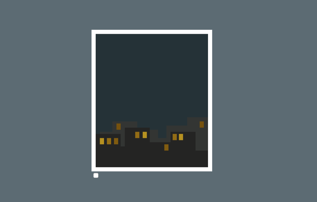
Add the rain:
.rain {
  position: absolute;
}

.rain:before {
  position: absolute;
  content:"";
  width:270px;
  height:10px;
  background-color: #fff;
  top:160px;
}

.rain:after {
  position: absolute;
  content:"";
  border-radius: 20px 20px 0 0;
  width:30px;
  height: 5px;
  background-color: #b2b2b2;
  top:155px;
  left:120px;
}

.dropletOne, .dropletTwo, .dropletThree, .dropletFour, .dropletFive {
  position: absolute;
  background-color: #fff;
  height: 15px;
  width: 1px;
  transform: rotate(25deg);
  box-shadow: -50px -50px #fff, 50px -270px #fff, 60px -100px #fff,-40px -130px #fff, -80px -250px #fff;
}

.dropletOne {
  left:200px;
  animation: rain 1.3s linear infinite;
}

.dropletTwo {
  top:-20px;
  left:100px;
  animation: rain .8s linear infinite .5s;
}

.dropletThree  {
  top:-50px;
  left:50px;
  animation: rain 1.2s linear infinite 1s;
}

.dropletFour {
  top:-70px;
  left:150px;
  animation: rain 1s linear infinite 1.3s;
}

.dropletFive {
  top:-50px;
  left:230px;
  animation: rain 1.1s linear infinite 1.7s;
}
Animate the rain:
@keyframes rain {
  0% {
    opacity: 0.9;
    top: -100px;
    transform: rotate(25deg) translateX(0);
  }
  100% {
    opacity: 0;
    top: 600px;
    transform: rotate(25deg) translateX(-150px);;
  }
}
Style the rest of the window:
.shine {
  position: absolute;
  background-color: rgba(255,255,255,0.03);
  width:70px;
  height:290px;
  top:40px;
  left:20px;
  transform: skew(-30deg);
  box-shadow: 190px 0 rgba(255,255,255,0.03);
}
.roll {
  position: absolute;
  z-index:10;
  background-color: #333;
  width: 320px;
  height: 15px;
  border-radius:20px 20px 0 0;
  left:-15px;
  top:-10px;
}

.roll:before {
  position: absolute;
  width:350px;
  content:"";
  background-color: #fff;
  height:15px;
  left:-15px;
  top:350px;
  box-shadow: 0 10px 10px rgba(0,0,0,0.15);
}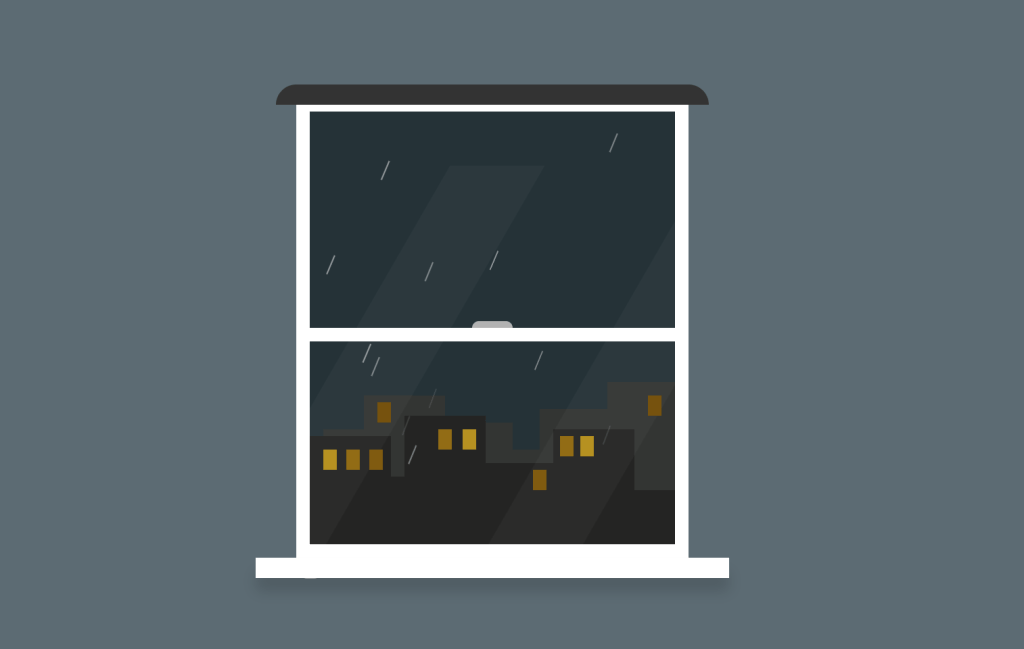
Add the blind:
.blind {
  position: absolute;
  width: 290px;
  height: 50px;
  background-color: #9db4c0;
  left:0;
  top:0;
  z-index:2;
  transition: .5s;
  box-shadow: inset 0 -7px rgba(0,0,0,0.1), 0 10px 10px rgba(0,0,0,0.15);
}

.blind:before {
  content:"";
  position: absolute;
  background-color: #333;
  width:2px;
  height: 130px;
  top:0;
  left:300px;
}

.blind:after {
  content:"";
  position: absolute;
  width: 10px;
  height:25px;
  border-radius:20px;
  background-color: #333;
  top:130px;
  left:296px;
  cursor: pointer;
}
To animate the blind (open/close on click):
input#blind {
  display: none;
}

#blind:checked + .blind {
  height: 340px;
}
Watch also the video tutorial:
Enjoy coding!
Hey, here’s something that might interest you: