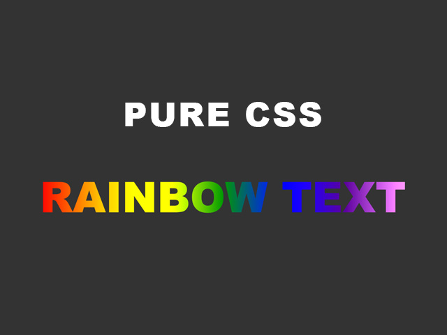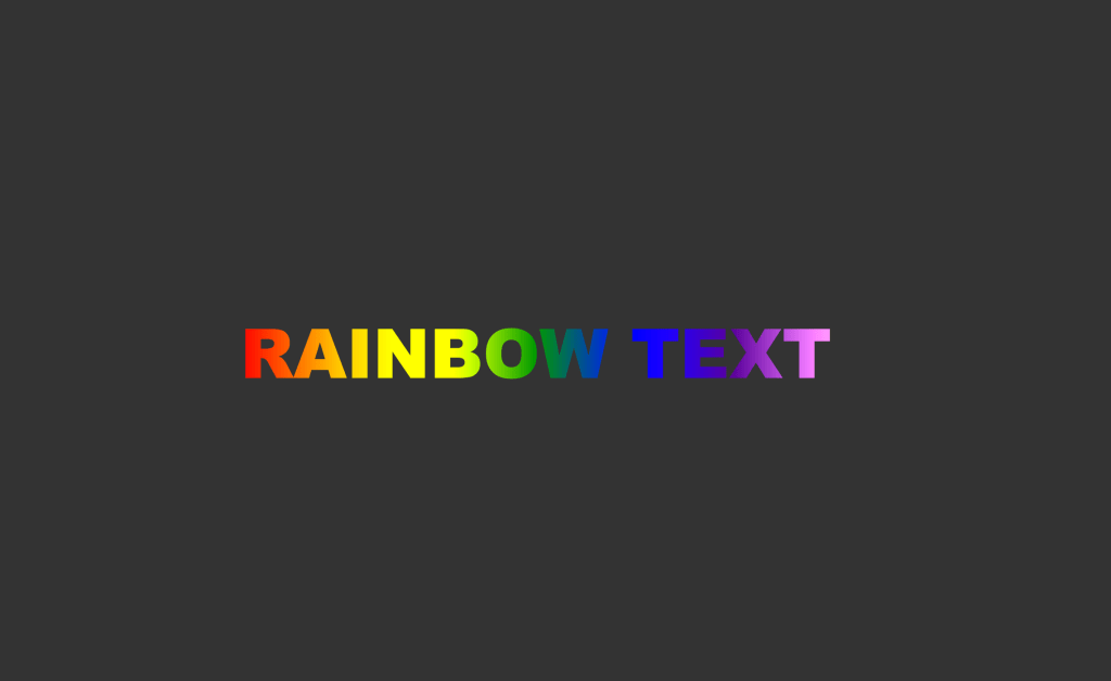
The colours of the rainbow are Red, Orange, Yellow, Green, Blue, Indigo(*colour between blue and purple) and Violet.
I will use exactly these colours to create the rainbow text and the animation.
Demo:
To create the CSS Rainbow Text Effect and the Animation follow the steps below and watch the video tutorial:
Step1.
Add HTML
<div class="rainbowText">RAINBOW TEXT</div>Step2.
Add CSS
Set the colour and position of the background and the elements:
body {
  background-color: #333;
  display: flex;
  justify-content:center;
  align-items: center;
  height: 100vh;
}
Style your text.
Create the linear-gradient with 7 colours of the rainbow:
.rainbowText {
  font-family:arial black;
  font-size:70px;
  background-image:
    linear-gradient(to right, red,orange,yellow,green,blue,indigo,violet);
  -webkit-background-clip: text;
  -webkit-text-fill-color: transparent;
  animation: move 35s linear infinite;
Step3.
Add CSS Animation
@keyframes move {
	to {
		background-position: 4500vh;
	}
}
To see the live output of the animation go to lenastanley.com.
Watch also the video tutorial:
Enjoy coding!
Read also:
CSS Mirror/ Reflection Text Effect