To learn how to create the CSS Snow Globe follow the steps below and watch the video tutorial.
Demo:
Step1.
Add HTML
<div class="snow-ball">
  <div class="snow-globe">
  <div class="ball-container">
    <div class="cottage">
      <div class="roof"></div>
      <div class="window"></div>
      <div class="chimney">
        <div id="up" class="smoke"></div>
        <div id="up" class="smoke2"></div>
      </div>
    </div>
    <div class="snowman">
      <div class="scarf"></div>
      <div class="hat"></div>
    </div>
    <div class="trees"></div>
    <div class="trees2"></div>
    <div class="reflection"></div>
    <div class="snowfall">
      <div class="snowflake"></div>
      <div class="snowflake1"></div>
      <div class="snowflake2"></div>
    </div>
  </div>
  <div class="holder"></div>
  </div>
  <div class="shadow"></div>
</div>
Step2.
Add CSS
Set the colour and the position of the background and elements:
body {
  display: flex;
  height: 100vh;
  justify-content: center;
  align-items: center;
  background-color: #ade8f4;
  overflow: hidden;
}

.snow-ball {
  position: relative;
  top:-15px;
}
Style the snow globe:
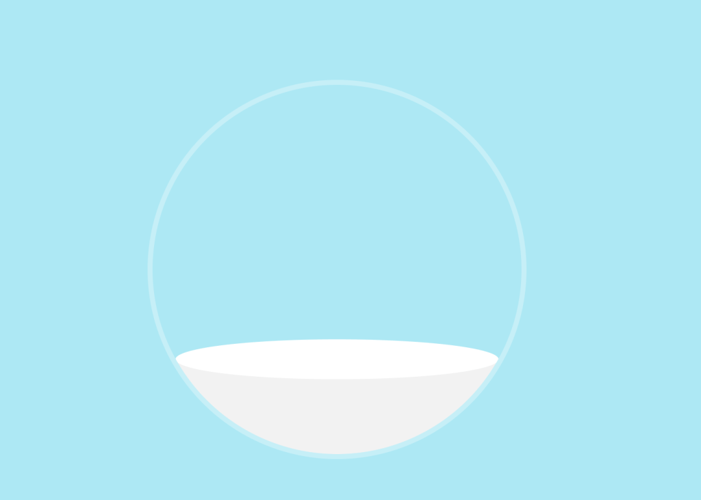
.ball-container {
  position: relative;
  width: 370px;
  height: 370px;
  border-radius: 50%;
  border: 5px solid rgba(255,255,255,0.3);
  overflow: hidden;
}

.ball-container:before {
  content:"";
  position: absolute;
  background-color: #f2f2f2;
  width:350px;
  height: 110px;
  top:275px;
}

.ball-container:after {
  content:"";
  position: absolute;
  background-color: white;
  border-radius: 50%;
  width:324px;
  height:40px;
  top:255px;
  left:23px;
}
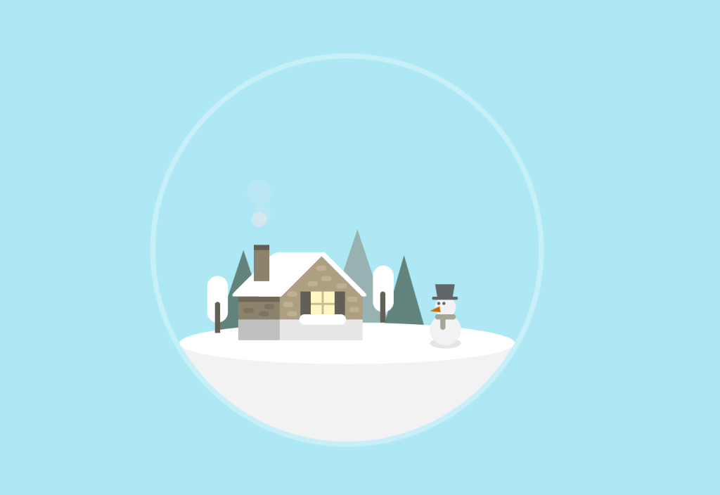
Style the cottage:
.cottage {
  position: absolute;
  z-index:2;
  width: 80px;
  height: 40px;
  background-color: #aca081;
  box-shadow: -40px 0 #8d826c;
  top:230px;
  left:120px;
}

.cottage:before {
  content:"";
  position: absolute;
  background-color: #aca081;
  width:57.5px;
  height: 57.5px;
  transform: rotate(45deg);
  top:-28px;
  left:11px;
}

.cottage:after {
  content:"";
  position: absolute;
  background-color: #e7e7e7;
  box-shadow: -40px 0 #c0c0c0;
  width: 80px;
  height:20px;
  top:22px;
}

.roof {
  position: absolute;
  background-color: rgba(0,0,0,0.2);
  width:40px;
  height: 5px;
  left:-40px;
}

.roof:before {
  content:"";
  position: absolute;
  background-color: white;
  border-radius: 5px 0px 0px 5px;
  width:50px;
  height: 43px;
  top:-43px;
  transform: skew(-45deg);
  left:13px;
}

.roof:after {
  content:"";
  position: absolute;
  transform: skew(45deg);
  background-color: white;
  width: 7px;
  height: 43px;
  border-radius: 0 2px 5px 0;
  top:-43px;
  left:98px;
}

.window {
  position: absolute;
  width: 23px;
  height: 23px;
  background-color: #fff7c2;
  top:-5px;
  left:30px;
  box-shadow: 10px 0 #625f56, -10px 0 #625f56;
}

.window:before {
  content:"";
  position: absolute;
  width: 23px;
  height: 2px;
  background-color: #c5bb97;
  top:11px;
}

.window:after {
  content:"";
  position: absolute;
  width: 2px;
  height: 23px;
  background-color: #c5bb97;
  top:0;
  left:10.3px;
}

.chimney {
  position: absolute;
  background-color: #8d826c;
  width:15px;
  height:30px;
  top:-45px;
  left:-25px;
  box-shadow: 0 -5px #625f56;
  z-index:3;
}

.chimney:before {
  content:"";
  position: absolute;
  width:10px;
  height: 5px;
  background-color: #bfaf94;
  border-radius:10px;
  top: 15px;
  left: 60px;
  box-shadow: 5px 10px #bfaf94, -8px 15px #bfaf94, -28px 25px #bfaf94, -32px 35px #bfaf94, 20px 17px #bfaf94, 30px 30px #bfaf94, 32px 40px #bfaf94,-28px 44px #bfaf94, -50px 37px #7d7360, -55px 44px #7d7360, -70px 41px #7d7360;
}

.chimney:after {
  content:"";
  position: absolute;
  background-color: white;
  width:45px;
  height: 10px;
  top:62px;
  left:44px;
  border-radius:5px;
}
And add smoke from the chimney:
#up {
  position: absolute;
  width: 20px;
  height: 20px;
  background-color: #e5e5e5;
  border-radius: 50%;
  opacity: 0;
  top: -25px;
  left: -5px;
  z-index:-1;
}

.smoke {
  animation: up 2.5s ease-out infinite;
}

.smoke2 {
  animation: up 1.7s ease-out infinite 1s;
}

.smoke2:before {
  content:"";
  position: absolute;
  left:5px;
  width:15px;
  height:15px;
  background-color: #e5e5e5;
  border-radius:50%;
  top:20px;
}

@keyframes up {
  0%{
    transform: translateY(0) scale(0.5);
    opacity: 0.8;
  }
  100%{
    transform: translateY(-50px) scale(1.35);
    opacity: 0.1;
  }
}
Style trees and the snowman:
.trees {
  position: absolute;
  background-color: white;
  width:20px;
  height:45px;
  border-radius:10px;
  left:50px;
  top:210px;
  z-index:3;
  box-shadow: 160px -10px white;
}

.trees:before {
  content:"";
  position: absolute;
  background-color: #625f56;
  width:5px;
  border-radius:5px 5px 0 0;
  height:30px;
  left:7.5px;
  top:25px;
  box-shadow: 159.5px -10px #625f56;
}

.trees2 {
  position: absolute;
  height:0;
  width:0;
  border-left: 30px solid transparent;
  border-right: 30px solid transparent;
  border-bottom: 90px solid #97b2b0;
  top:165px;
  left:165px;
}

.trees2:before {
  content:"";
  position: absolute;
  height:0;
  width:0;
  border-left: 20px solid transparent;
  border-right: 20px solid transparent;
  border-bottom: 70px solid #62827c;
  top:25px;
  left:25px;
}

.trees2:after {
  content:"";
  position: absolute;
  height:0;
  width:0;
  border-left: 30px solid transparent;
  border-right: 30px solid transparent;
  border-bottom: 90px solid #62827c;
  left:-140px;
  top:20px;
}

.snowman {
  position: absolute;
  border-radius:50%;
  background-color: rgba(0,0,0,0.1);
  width:30px;
  height:10px;
  top:270px;
  left:265px;
  z-index:4;
}

.snowman:before {
  content:"";
  position: absolute;
  background-color: #f2f2f2;
  width:30px;
  height:30px;
  border-radius: 50%;
  top:-23px;
}

.snowman:after {
  content:"";
  position: absolute;
  background-color: #f2f2f2;
  width:20px;
  height:20px;
  border-radius: 50%;
  top:-40px;
  left:5px;
}

.scarf {
  position: absolute;
  width:20px;
  height:5px;
  background-color: #a5a696;
  top:-23px;
  left:5px;
  border-radius:10px;
  z-index:5;
}

.scarf:before {
  content:"";
  position: absolute;
  width:5px;
  height: 15px;
  background-color: #a5a696;
  left:5px;
  border-radius:10px;
}

.scarf:after {
  content:"";
  position: absolute;
  height:0;
  width:0;
  border-top:3px solid transparent;
  border-bottom:3px solid transparent;
  border-right: 10px solid #ca6702;
  top:-7px;
  left:-5px;
  transform: rotate(-10deg);
}

.hat {
  position: absolute;
  z-index:6;
  border-top: 12px solid #60676a;
  border-right: 2px solid transparent;
  border-left: 2px solid transparent;
  border-bottom: 5px solid transparent;
  width:15px;
  top:-52px;
  left:5px;
}

.hat:before {
  content:"";
  position: absolute;
  background-color: #60676a;
  width: 25px;
  height:3px;
  border-radius:10px;
  left:-5px;
}

.hat:after {
  content:"";
  position: absolute;
  background-color: #60676a;
  border-radius:50%;
  width:3px;
  height:3px;
  top:5px;
  box-shadow: 5px 0 #60676a;
}
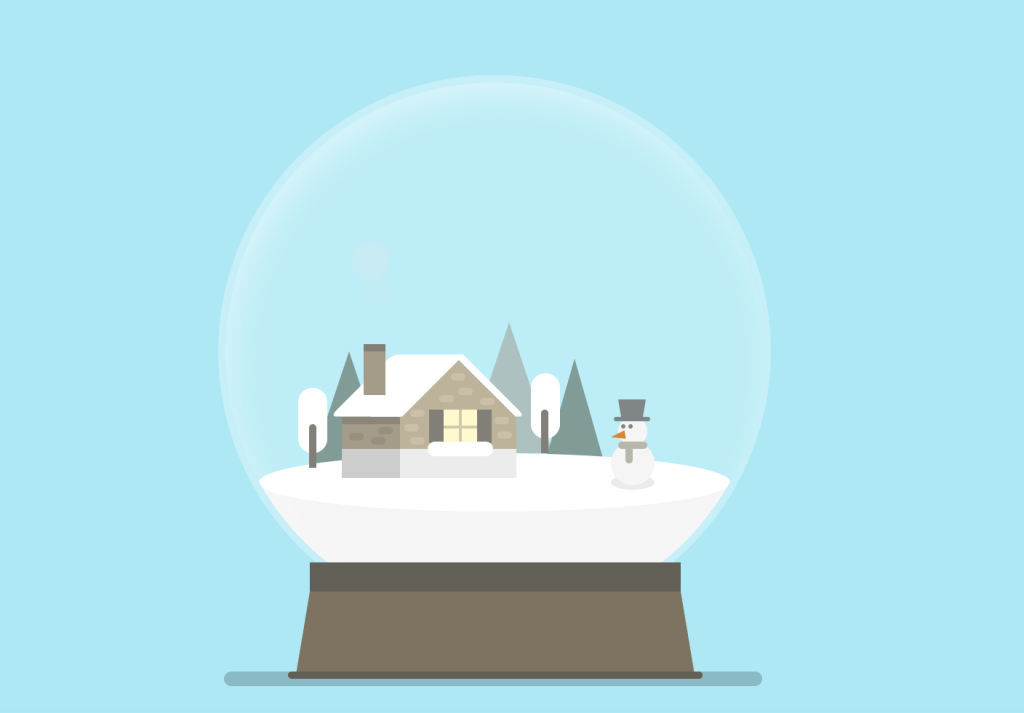
Add the ball reflection and the holder with the shadow:
.reflection {
  position: absolute;
  z-index:7;
  background-color: rgba(255,255,255,0.2);
  width: 370px;
  height: 370px;
  border-radius: 50%;
  box-shadow: inset 5px 10px 20px rgba(255,255,255,0.4);
}
.holder {
  position: absolute;
  z-index:8;
  width:255px;
  height:20px;
  background-color: #625f56;
  top:335px;
  left:63px;
}

.holder:before {
  content:"";
  position: absolute;
  width: 255px;
  height:0;
  border-right: 10px solid transparent;
  border-left: 10px solid transparent;
  border-bottom: 60px solid #7d7360;
  top:20px;
  left:-10px;
}

.holder:after {
  content:"";
  position: absolute;
  width:285px;
  height: 5px;
  border-radius:20px;
  background-color: #625f56;
  top:75px;
  left:-15px;
}

.shadow {
  position: absolute;
  width: 370px;
  height: 10px;
  border-radius:20px;
  background-color: rgba(0,0,0,0.2);
  top:410px;
  left:4px;
  transition: .3s;
}
Create the Snowfall:
.snowfall {
  position: absolute;
  z-index:6;
}

.snowflake, .snowflake1, .snowflake2 {
  position: absolute;
  border-radius:50%;
  background-color: white;
  width: 7px;
  height: 7px;
  filter: blur(1px);
  left: 50px;
  box-shadow: 40px 40px white, -40px -40px white, 80px 60px white, 100px -70px white, 110px -20px white,20px -20px white,120px 40px white, 150px 10px white, 180px 20px white, 50px -60px white, 100px 20px white, 150px -80px white, 170px -50px white, 185px -70px white, 190px 40px white, 220px -10px white, 230px -60px white, 240px -30px white, 250px 20px white, 260px -80px white, -20px 20px white, 10px 10px white, 280px -40px white, 300px -10px white, 320px -100px white, 290px -110px white, 100px -100px white, 80px -120px white;
  animation: fall 2.5s linear infinite;
}

.snowflake {
  left:0;
}

.snowflake1 {
  top:-80px;
  left: 60px;
  animation-delay: .5s;
}

.snowflake2 {
  top: -70px;
  left: 100px;
  animation-delay: 1s;
}

@keyframes fall {
  0 {transform: translateY(-50px);opacity:0.9;}
  100% {transform: translateY(380px);opacity:0.2;}
}
Add effects on hover:
.snow-ball:hover .snow-globe {
  animation: shake .3s ease;
  animation-iteration-count: 2;
}

@keyframes shake {
  0% {transform: rotate(0);}
  25% {transform: rotate(-30deg);}
  50% {transform: rotate(0);}
  75% {transform: rotate(30deg);}
  100% {transform: rotate(0);}
}
.snow-ball:hover .shadow {
  opacity:0;
}

.snow-ball:hover .snowfall {
  animation: bounce .5s ease;
  animation-iteration-count: 2;
}

@keyframes bounce {
	0%, 100% {transform: translateX(0);}
	10%, 30%, 50%, 70%, 90% {transform: translateX(-20px);}
	20%, 40%, 60%, 80% {transform: translateX(20px);}
}
Enjoy coding!
Watch also the video tutorial:
Hey, here’s something that might interest you: