The CSS opacity property sets the opacity of an element. The opacity property can take a value from 0.0 to 1.0 (default 1).

Example 1:
<!DOCTYPE html>
<html>
<head>
<style>
div {
  background-color: #e76f51;
  opacity: 0.5;
}
</style>
</head>
<body>


<p>The following div element's opacity is 0.5. Note that both the text and the background-color are affected by the opacity level:</p>

<div>Lorem ipsum dolor sit amet, consectetur adipiscing elit. Etiam semper diam at erat pulvinar, at pulvinar felis blandit...</div>

</body>
</html>
Output:
The following div element’s opacity is 0.5. Note that both the text and the background-color are affected by the opacity level:
When using the opacity property to add transparency to the background of an element, all of its child elements become transparent as well. This can make the text inside a fully transparent element hard to read. If you don’t want to apply opacity to the child elements, use RGBA colour values (more about colours in HTML/CSS you can here and here.)
Example 2:
<!DOCTYPE html>
<html>
<head>
<style>
div {
  background-color: #2a9d8f;
  padding: 10px;
}

div.first {
  opacity: 0.1;
}

div.second {
  opacity: 0.3;
}

div.third {
  opacity: 0.6;
}
</style>
</head>
<body>

<p>Note: The opacity property adds transparency to the background of an element, and to all of its child elements as well. This makes the text inside a transparent element hard to read:</p>

<div class="first"><p>opacity 0.1</p></div>
<div class="second"><p>opacity 0.3</p></div>
<div class="third"><p>opacity 0.6</p></div>
<div><p>opacity 1 (default)</p></div>

</body>
</html>
Output:
Note: The opacity property adds transparency to the background of an element, and to all of its child elements as well. This makes the text inside a transparent element hard to read:
opacity 0.1
opacity 0.3
opacity 0.6
opacity 1 (default)
Example 3, with RGBA colours value:
<!DOCTYPE html>
<html>
<head>
<style>
div {
  background: rgb(76, 175, 80);
  padding: 10px;
}

div.first {
  background: rgba(76, 175, 80, 0.1);
}

div.second {
  background: rgba(76, 175, 80, 0.3);
}

div.third {
  background: rgba(76, 175, 80, 0.6);
}
</style>
</head>
<body>

<div class="first"><p>10% opacity</p></div>
<div class="second"><p>30% opacity</p></div>
<div class="third"><p>60% opacity</p></div>
<div><p>default</p></div>

</body>
</html>
Output:
10% opacity
30% opacity
60% opacity
default
The opacity property is often used with the :hover selector to change opacity on mouse-over:
<!DOCTYPE html>
<html>
<head>
<style>
img {
  opacity: 0.5;
}

img:hover {
  opacity: 1.0;
}
</style>
</head>
<body>

<p>The opacity property is often used together with the :hover selector to change the opacity on mouse-over:</p>
<img src="https://lenadesign.org/wp-content/uploads/2021/05/cycling-animation.jpg" alt="bike" width="170" height="100">
<img src="https://lenadesign.org/wp-content/uploads/2020/03/birthday-cake.jpg" alt="cake" width="170" height="100">
<img src="https://lenadesign.org/wp-content/uploads/2021/02/blog-rocket.jpg" alt="computer" width="170" height="100">

</body>
</html>
Output:
The opacity property is often used together with the :hover selector to change the opacity on mouse-over:


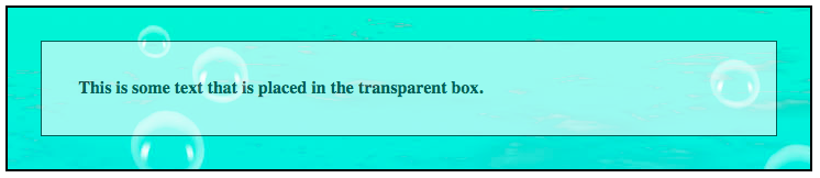
To create the text in transparent box, first, create a <div> element (class=”background”) with a background image, and a border. Then we create another <div> element (class=”transbox”) inside the first <div>. The <div class=”transbox”> have a background colour, and a border – the div is transparent. Inside the transparent <div>, we can add some text inside a <p> element.
Example:
<!DOCTYPE html>
<html>
<head>
<style>
div.background {
  background: url(14.jpg) repeat;
  border: 2px solid black;
}

div.transbox {
  margin: 30px;
  background-color: #ffffff;
  border: 1px solid black;
  opacity: 0.6;
}

div.transbox p {
  margin: 5%;
  font-weight: bold;
  color: #000000;
}
</style>
</head>
<body>

<div class="background">
  <div class="transbox">
    <p>This is some text that is placed in the transparent box.</p>
  </div>
</div>

</body>
Output:
Enjoy coding!
Read also: