
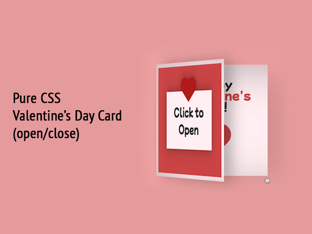
To learn how to create the CSS Valentine’s Day Card (Open/Close on Click) follow the steps below and watch the video tutorial.
Demo:
Step1.
Add HTML
<div class="valentines-day-card">
  <input id="open" type="checkbox">
  <label class="open" for="open"></label>
<div class="card-front">
  <div class="note">Click to Open</div>
</div>

  <div class="card-inside">
    <div class="text-one">Happy
    </div>
    <div class="heart"></div>
    <div class="smile"></div>
    <div class="eyes"></div>
</div>
</div>
Step2.
Add CSS
Import the font:
Font source: Google Fonts
To read how to import the font in CSS click here.
@import url('https://fonts.googleapis.com/css2?family=Mochiy+Pop+P+One&display=swap');Set the colour and the position of the background and the elements:
body {
  height: 100vh;
  display: flex;
  justify-content: center;
  align-items: center;
  background-color: #f2acac;
  font-family: 'Mochiy Pop P One', sans-serif;
}
Style the card (make the card open/ close):
input#open {
  display: none;
}

.valentines-day-card {
  position: relative;
  width: 300px;
  height:300px;
  transform-style: preserve-3d;
	transform: perspective(2500px);
  transition: .3s;
}

.card-front {
  position: relative;
  background-color: #fff0f3;
  width: 300px;
  height:300px;
  transform-origin: left;
  box-shadow: inset 100px 20px 100px rgba(0,0,0,.15), 30px 0 50px rgba(0,0,0,0.3);
  transition: .3s;
}

.card-front:before {
  content:"";
  position: absolute;
  width: 280px;
  height: 280px;
  background-color: #d04e4e;
  top: 10px;
  left: 10px;
}

.card-inside {
  position: absolute;
  background-color: #fff0f3;
  width: 300px;
  height:300px;
  z-index:-1;
  left:0;
  top:0;
  box-shadow: inset 100px 20px 100px rgba(0,0,0,0.22), 100px 20px 100px rgba(0,0,0,0.1);
}

.open {
  position: absolute;
  width: 300px;
  height:300px;
  left:0;
  top:0;
  background-color: transparent;
  z-index:6;
  cursor: pointer;
}

#open:checked ~ .card-front {
  transform: rotateY(-155deg);
  box-shadow: inset 100px 20px 100px rgba(0,0,0,.13), 30px 0 50px rgba(0,0,0,0.1);
}

#open:checked ~ .card-front:before {
  z-index:5;
  background-color: #fff0f3;
  width:300px;
  height:300px;
  top:0;
  left:0;
  box-shadow: inset 100px 20px 100px rgba(0,0,0,.1), 30px 0 50px rgba(0,0,0,0.1);
}
Style the front side of the card:
.note {
  position: relative;
  width: 200px;
  height: 150px;
  background-color: #fff0f3;
  top:75px;
  left:50px;
  color: #333;
  font-size:30px;
  display: flex;
  align-items: center;
  text-align: center;
  filter: drop-shadow(0 0 20px rgba(0,0,0,0.3));
}

.note:before, .note:after {
  position: absolute;
  content:"";
  background-color: #ba1c1c;
  width: 40px;
  height:40px;
}

.note:before {
  transform: rotate(-45deg);
  top:-20px;
  left:80px;
}

.note:after {
  border-radius:50%;
  top:-35px;
  left:65px;
  box-shadow:30px 0 #ba1c1c;
}
Style and animate the card inside:
.text-one {
  position: absolute;
  color: #333;
  font-size: 30px;
  top:30px;
  width:300px;
  text-align: center;
}

.text-one:before, .text-one:after {
  position: absolute;
  left:5px;
  text-align: center;
  width:300px;
}

.text-one:before {
  content:"Valentine's";
  top:30px;
  color: #d04e4e;
}

.text-one:after {
  content:"day!";
  top:60px;
}

.heart {
  position: relative;
  background-color: #d04e4e;
  height: 60px;
  width:60px;
  top:180px;
  left:120px;
  transform: rotate(-45deg);
  animation: .8s beat infinite;
}

.heart:before, .heart:after {
  content:"";
  background-color: #d04e4e;
  border-radius:50%;
  height: 60px;
  width: 60px;
  position: absolute;
  }

.heart:before {
  top:-30px;
  left:0;
}

.heart:after {
  left:30px;
  top:0;
}

.smile {
  position: absolute;
  width:30px;
  height:15px;
  background-color: #333;
  z-index:1;
  border-radius: 0 0 100px 100px;
  top:200px;
  left:135px;
  overflow: hidden;
}

.smile:before {
  content:"";
  position: absolute;
  border-radius:50%;
  width:20px;
  height:20px;
  background-color: #030202;
  top:5px;
  left:5px;
}

.eyes {
  position: absolute;
  border-radius: 50%;
  background-color: #333;
  width:10px;
  height:10px;
  z-index:1;
  top:190px;
  left:165px;
  box-shadow: -40px 0 #333;
  transform-origin: 50%;
  animation: close 2s infinite;
}

@keyframes close {
    0%, 100% {
        transform: scale(1, .05);
    }
    5%, 95% {
        transform: scale(1, 1);
    }
}

@keyframes beat {
  0%, 40%, 100% {
    transform: scale(1) rotate(-45deg);
  }
  25%, 60% {
    transform: scale(1.1) rotate(-45deg);
  }
}
Watch also the video tutorial:
Enjoy coding!
Hey, here’s something that might interest you:


