
Demo:
To create the CSS Birthday Animation follow the steps below and watch the video tutorial:
- Add HTML
- Add CSS
Step1.
Add HTML
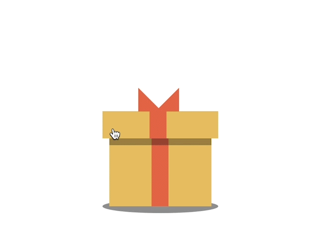
<div class="birthday-gift">
  <div class="gift">
  <input id='click' type='checkbox'>
  <label class='click' for='click'></label>
  <div class="wishes">Happy Birthday!</div>
       <div class="sparkles">
      <div class="spark1"></div>
      <div class="spark2"></div>
      <div class="spark3"></div>
      <div class="spark4"></div>
      <div class="spark5"></div>
      <div class="spark6"></div>
    </div>
    </div>
</div>
Step2.
Add CSS
Set the color and the position of the background and elements:
body {
  display: flex;
  justify-content: center;
  align-items: center;
  height: 100vh;
}
.birthday-gift {
  position: relative;
}
.birthday-gift:before {
  content:"";
  position: absolute;
  width: 170px;
  height:20px;
  border-radius:50%;
  background-color: rgba(0,0,0,0.4);
  top:90px;
  left:-10px;
}
Style the gift:
.gift {
  position: relative;
  width: 150px;
  height: 100px;
  background-color: #e9c46a;
}

.gift:before {
  content:"";
  position: absolute;
  width: 25px;
  height: 100px;
  background-color: #e76f51;
  left:62px;
}

.gift:after {
  content:"";
  position: absolute;
  box-shadow: inset 0 10px rgba(0,0,0,0.3);
  width: 150px;
  height: 100px;
}
Style the box cover/ input:
input#click {
  display: none;
}
.click {
  position: absolute;
  background-color: #e9c46a;
  width: 170px;
  height: 40px;
  top:-40px;
  left:-10px;
  transform-origin: bottom left;
  transition: .3s;
  cursor: pointer;
}

.click:before {
  content:"";
  position: absolute;
  width: 25px;
  height: 40px;
  background-color: #e76f51;
  left:69px;
}

.click:after {
  content:"";
  position: absolute;
  width: 5px;
  height: 0;
  border-bottom: 30px solid #e76f51;
  border-top: 30px solid #e76f51;
  border-left: 0px solid transparent;
  border-right: 30px solid transparent;
  transform: rotate(-90deg);
  left:65px;
  top:-47px;
}
Style the wishes:
.wishes {
  position: absolute;
  transition: .5s;
  color: #333;
  font-size: 37px;
  text-align: center;
  z-index:-1;
  left:5px;
}
Add input label animation (to open the box and move the wishes upon click):
#click:checked + .click {
  transform: rotate(-110deg) scaleX(0.85);
}
#click:checked ~ .wishes {
  transform: translateY(-100px);
}
Add some sparkles and animate them:
.sparkles {
  position: absolute;
  display: none;
  top:-15px;
  z-index:-2;
  left:40px;
}

.spark1, .spark2, .spark3, .spark4, .spark5, .spark6 {
  position: absolute;
  background-color: #fee440;
  border-radius:50%;
  top:-9px;
  z-index:-1;
}

.spark1 {
  width: 8px;
  height:8px;
  left:30px;
  top:-9px;
  animation: fire 0.9s ease-in-out infinite, color 0.4s linear infinite;
}

.spark1:before {
  content:"";
  position: absolute;
  width:5px;
  height:5px;
  top:8px;
  left:11px;
  background-color: #fee440;
  border-radius:50%;
}

.spark2 {
  width: 9px;
  height:9px;
  left:33px;
  top:-5px;
  animation: fire2 0.28s ease-in-out infinite, color 0.4s linear infinite;
}

.spark2:before {
  content:"";
  position: absolute;
  width:5px;
  height:5px;
  top:12px;
  left:3px;
  background-color: #fee440;
  border-radius:50%;
}

.spark3 {
  width: 8.5px;
  height:8.5px;
  left:33px;
  top:-5px;
  animation: fire3 0.36s ease-in-out infinite, color2 0.4s linear infinite;
}

.spark3:before {
  content:"";
  position: absolute;
  width:5px;
  height:5px;
  top:12px;
  left:-1px;
  background-color: #fee440;
  border-radius:50%;
}

.spark4 {
  width: 7px;
  height:7px;
  left:27px;
  top:-5px;
  animation: fire2 0.24s ease-in-out infinite, color2 0.2s linear infinite;
}

.spark5 {
  width: 7px;
  height:7px;
  left:29px;
  top:-5px;
  animation: fire3 0.45s ease-in-out infinite, color 0.2s linear infinite;
}

.spark6 {
  width: 6px;
  height:6px;
  left:29px;
  top:-5px;
  animation: fire 0.35s ease-in-out infinite, color2 0.2s linear infinite;
}

@keyframes fire3 {
  100% { transform:translateX(20px) translateY(-93px);
         opacity: 0.3; }
}

@keyframes fire2 {
  100% { transform:translateX(-5px) translateY(-90px);
         opacity: 0.3; }
}

@keyframes fire {
  100% { transform:translateX(-25px) translateY(-95px);
         opacity: 0.3; }
}

@keyframes color {
  from {background-color: #d00000;}
  to {background-color: #0081a7;}
}

@keyframes color2 {
  from {background-color: #8cff00;}
  to {background-color: #1d2d44;}
}
Add input label animation:
#click:checked ~ .sparkles {
  display: block;
}
Watch also the video tutorial:
Enjoy coding!
Read also: