The CSS repeating-linear-gradient() function repeats linear gradients.
Syntax:
background-image: repeating-linear-gradient(angle | to side-or-corner, color-stop1, color-stop2...);
angle – specifies an angle of direction for the gradient (default is 180deg).
side-or-corner – specifies the position of the starting-point of the gradient line. It consists of two keywords: the first one indicates the horizontal side, left or right, and the second one the vertical side, top or bottom. The order is not relevant and each of the keyword is optional.
color-stop1, color-stop2… – color stops are the colors you want to render smooth transitions among. This value consists of a color value, followed by an optional stop position (a percentage between 0% and 100% or a length along the gradient axis).
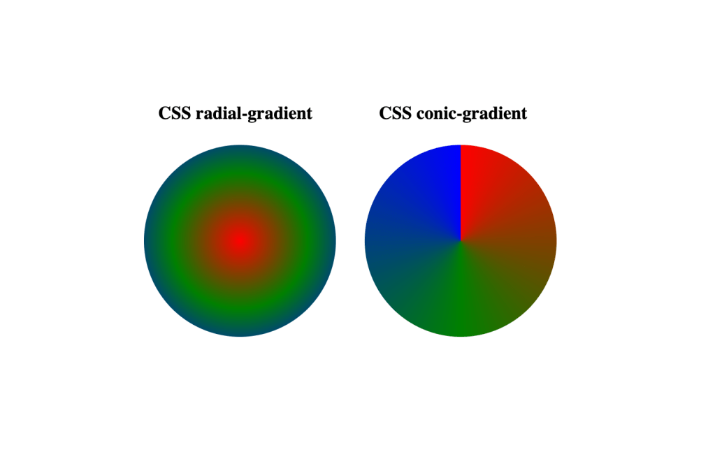
The CSS radial-gradient() function settles a radial gradient as the background image.
Syntax:
background-image: radial-gradient(shape size at position, start-color, ..., last-color);
shape – specifies the shape of the gradient (ellipse (default), circle).
size – specifies the size of the gradient (farthest-corner (default), closest-side, closest-corner, farthest-side).
position – specifies the position of the gradient (center (default)).
start-color, …, last-color – color stops are the colors you want to render smooth transitions among. This value consists of a color value, followed by an optional stop position (a percentage between 0% and 100% or a length along the gradient axis).
A conic (conical) gradient is similar to a radial-gradient. The difference between them is that in the case of radial gradient the color stops are defined by a length, and in the case of a conic gradient, the color stops are defined with an angle.