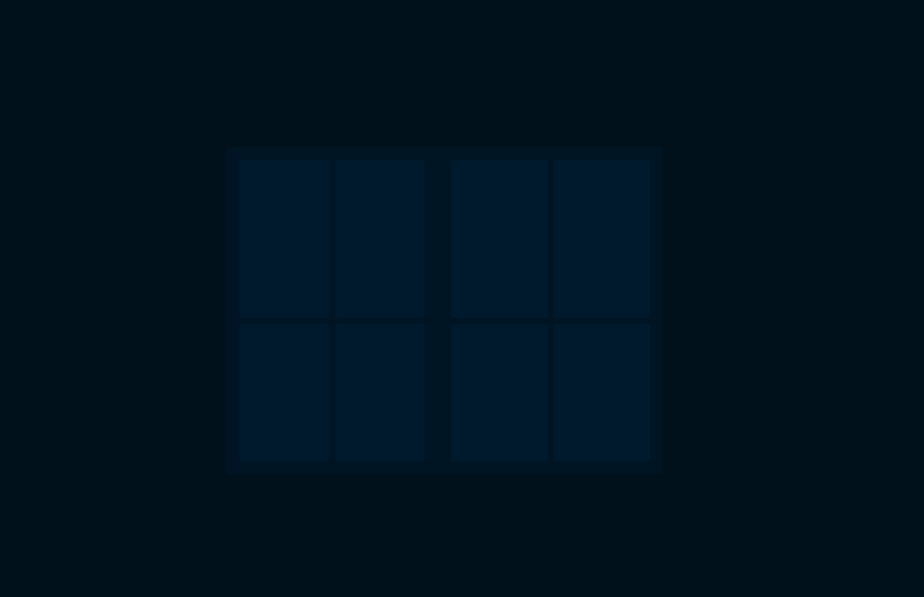
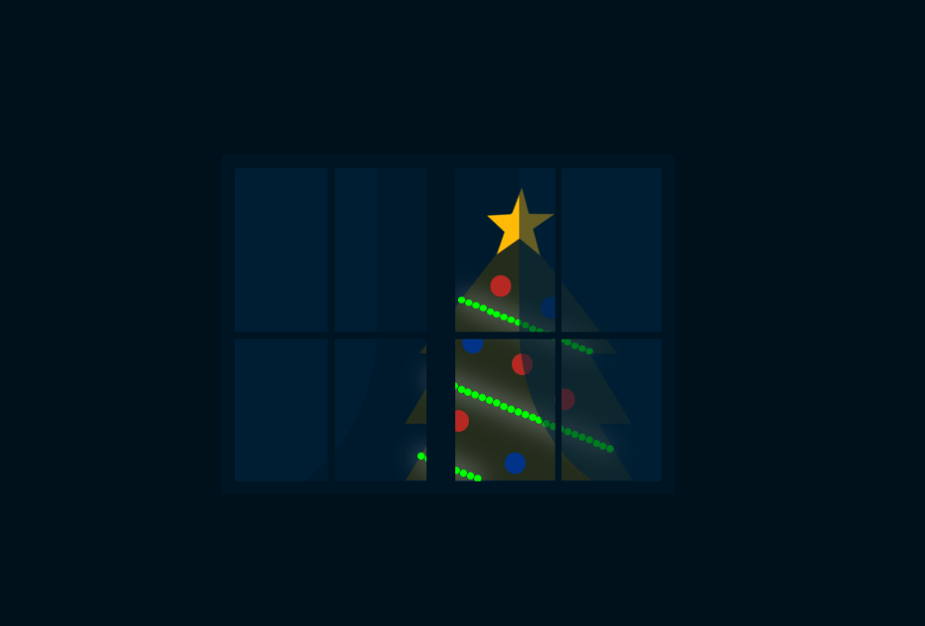
To learn how to create the CSS Christmas Animation follow the steps below.
Demo:
*to see the CSS Christmas Animation on the website click here . Step1.
Add HTML
<div class="merry-christmas">
  <div class="window">
    <div class="christmas-tree">
      <div class="star"></div>
      <div class="christmas-lights"></div>
      <div class="balls"></div>
    </div>
    <div class="curtains"></div>
    <div class="window-details"></div>
  </div>
  <div class="snow">
    <div class="snowflakes"></div>
    <div class="snowflakes-2"></div>
    <div class="snowflakes-3"></div>
    <div class="snowflakes-4"></div>
    <div class="snowflakes-5"></div>
  </div>
  <div class="bricks"></div>
</div>
Step2.
Add CSS
Set the colour and the position of the background and elements:
body {
  display: flex;
  height:100vh;
  align-items: center;
  justify-content: center;
  background-color: #00111c;
  overflow: hidden;
}

.merry-christmas {
  position: relative;
}
Style the window:
.window {
  position: relative;
  overflow: hidden;
  width:300px;
  height:220px;
  border: 10px solid #001523;
  background-color: #001a2c;
}
.window-details {
 position: absolute;
 z-index:3;
 width:300px;
 height:5px;
 background-color: #001523;
 top:115px;
}

.window-details:before, .window-details:after {
  content:"";
  position: absolute;
  background-color: #001523;
  height: 220px;
  top:-115px;
}

.window-details:before {
  width:20px;
  left: 135px;
}

.window-details:after {
  width:5px;
  left:65px;
  box-shadow: 160px 0 #001523;
}
Add Christmas Tree and curtains:
.christmas-tree, .christmas-tree:before {
  position: absolute;
  width:100px;
  height:0;
  border-bottom: 50px solid #242c1d;
  border-right: 30px solid transparent;
  border-left: 30px solid transparent;
}

.christmas-tree {
  top: 170px;
  left:120px;
}

.christmas-tree:before {
  content:"";
  top:-40px;
  left:-30px;
}

.christmas-tree:after {
  content:"";
  height:0;
  position: absolute;
  border-bottom: 90px solid #242c1d;
  border-right: 70px solid transparent;
  border-left: 70px solid transparent;
  top:-130px;
  left:-20px;
}

.star {
  position: absolute;
  display: block;
  width: 0px;
  height: 0px;
  border-right: 25px solid transparent;
  border-bottom: 18px solid #ffba08;
  border-left: 25px solid transparent;
  transform: rotate(-35deg);
  top:-140px;
  left:25px;
  z-index:1;
    }

.star:before {
      border-bottom: 18px solid #ffba08;
      border-left: 8px solid transparent;
      border-right: 8px solid transparent;
      position: absolute;
      height: 0;
      width: 0;
      top: -10px;
      left: -17px;
      display: block;
      content: '';
      transform: rotate(-35deg);
    }

.star:after {
      position: absolute;
      display: block;
      top: 0.75px;
      left: -25px;
      width: 0px;
      height: 0px;
      border-right: 25px solid transparent;
      border-bottom: 18px solid #ffba08;
      border-left: 25px solid transparent;
      transform: rotate(-70deg);
      content:'';
}

.christmas-lights, .christmas-lights:before, .christmas-lights:after {
  position: absolute;
  width:5px;
  height: 5px;
  background-color: #ffba08;
  border-radius:50%;
}

.christmas-lights {
  top:-80px;
  left:7px;
  z-index:1;
  box-shadow:5px 2px #ffba08, 10px 4px #ffba08, 15px 6px #ffba08, 20px 8px #ffba08, 25px 10px #ffba08, 30px 12px #ffba08, 35px 14px #ffba08, 40px 16px #ffba08, 45px 18px #ffba08, 50px 20px #ffba08, 55px 22px #ffba08, 60px 24px #ffba08, 65px 26px #ffba08, 70px 28px #ffba08,75px 30px #ffba08, 80px 32px #ffba08, 85px 34px #ffba08, 90px 36px #ffba08;
  animation: light 17s linear infinite;
}

.christmas-lights:before {
  content:"";
  top:55px;
  left:-20px;
  box-shadow:5px 2px #ffba08, 10px 4px #ffba08, 15px 6px #ffba08, 20px 8px #ffba08, 25px 10px #ffba08, 30px 12px #ffba08, 35px 14px #ffba08, 40px 16px #ffba08, 45px 18px #ffba08, 50px 20px #ffba08, 55px 22px #ffba08, 60px 24px #ffba08, 65px 26px #ffba08, 70px 28px #ffba08,75px 30px #ffba08, 80px 32px #ffba08, 85px 34px #ffba08, 90px 36px #ffba08, 95px 38px #ffba08, 100px 40px #ffba08, 105px 42px #ffba08, 110px 44px #ffba08, 115px 46px #ffba08, 120px 48px #ffba08, 125px 50px #ffba08;
}

.christmas-lights:after {
  content:"";
  top:110px;
  left:-28px;
  box-shadow:5px 2px #ffba08, 10px 4px #ffba08, 15px 6px #ffba08, 20px 8px #ffba08, 25px 10px #ffba08, 30px 12px #ffba08, 35px 14px #ffba08, 40px 16px #ffba08;
}

@keyframes light {
  0% {filter: drop-shadow(0 0 8px #fff) brightness(1.2) hue-rotate(0) saturate(7);}
  50% {filter: drop-shadow(0 0 10px #fff) brightness(2) hue-rotate(360deg) saturate(7);}
  100% {filter: drop-shadow(0 0 8px #fff) brightness(1.2) hue-rotate(0) saturate(7);}
}

.balls {
  position: absolute;
  border-radius: 50%;
  height:15px;
  width: 15px;
  background-color: #b62922;
  box-shadow: 40px 30px #003488, 75px -15px #b62922, 45px -40px #b62922, 10px -55px #003488, 30px -95px #b62922, 65px -80px #003488;
  z-index:2;
}

.curtains {
  position: absolute;
  z-index:2;
}

.curtains:before, .curtains:after {
  content:"";
  position: absolute;
  background-color: rgba(0, 33, 55,0.6);
  width: 200px;
  height: 250px;
  top:-15px;
}

.curtains:before {
  border-radius: 0 0 50% 0;
  left:-100px;
}

.curtains:after {
  border-radius: 0 0 0 50%;
  left:200px;
}
Add some snow and bricks:
.snow {
  position: absolute;
  z-index:5;
}

.snow:before, .snow:after {
  content:"";
  position: absolute;
  background-color: white;
  width:30px;
  height:5px;
}

.snow:before {
  top:-120px;
  left:10px;
  border-radius: 0 20px 0 0;
  box-shadow: 230px 105px white;
}

.snow:after {
  border-radius:10px;
  top:-245px;
  left:280px;
  box-shadow: -15px 0 white, -40px 0 white, -85px 0 white, -170px 0 white,-195px 0 white;
}

.bricks {
  position: absolute;
  background-color: #001523;
  width: 80px;
  height: 25px;
  left:100px;
  top:250px;
  box-shadow: 100px 0 #001523, 240px -50px #001523, -240px -100px #001523, -220px -150px #001523, 300px -200px #001523,-150px -300px #001523;
}
and create the snowfall:
.snowflakes, .snowflakes-2, .snowflakes-3, .snowflakes-4, .snowflakes-5 {
  position: absolute;
  border-radius:50%;
  background-color: rgba(255,255,255,0.5);
  width:5px;
  height:5px;
  top:-500px;
  box-shadow: 100px -100px rgba(255,255,255,0.5), -100px -150px rgba(255,255,255,0.5), -200px -100px rgba(255,255,255,0.5), 0 -100px rgba(255,255,255,0.5), 200px -300px rgba(255,255,255,0.5), 100px -350px rgba(255,255,255,0.5), 150px -100px rgba(255,255,255,0.5), 70px -200px rgba(255,255,255,0.5), 300px -100px rgba(255,255,255,0.5), 400px -100px rgba(255,255,255,0.5), 450px -300px rgba(255,255,255,0.5), 500px -300px rgba(255,255,255,0.5), 600px -400px rgba(255,255,255,0.5), 550px -250px rgba(255,255,255,0.5), -200px -300px rgba(255,255,255,0.5), -100px -400px rgba(255,255,255,0.5), 700px -500px rgba(255,255,255,0.5),-400px -500px rgba(255,255,255,0.5), -350px -100px ;
  box-shadow: 100px -100px rgba(255,255,255,0.5), -100px -150px rgba(255,255,255,0.5), -200px -100px rgba(255,255,255,0.5), 0 -100px rgba(255,255,255,0.5), 200px -300px rgba(255,255,255,0.5), 100px -350px rgba(255,255,255,0.5), 150px -100px rgba(255,255,255,0.5), 70px -200px rgba(255,255,255,0.5), 300px -100px rgba(255,255,255,0.5), 400px -100px rgba(255,255,255,0.5), 450px -300px rgba(255,255,255,0.5), 500px -300px rgba(255,255,255,0.5), 600px -400px rgba(255,255,255,0.5), 550px -250px rgba(255,255,255,0.5), -200px -300px rgba(255,255,255,0.5), -100px -400px rgba(255,255,255,0.5), 700px -500px rgba(255,255,255,0.5),-400px -500px rgba(255,255,255,0.5), -350px -100px rgba(255,255,255,0.5), -500px -300px rgba(255,255,255,0.5), 800px -200px rgba(255,255,255,0.5), 750px -250px rgba(255,255,255,0.5), 680px -150px rgba(255,255,255,0.5), 900px -100px rgba(255,255,255,0.5), -700px -300px rgba(255,255,255,0.5),950px -310px rgba(255,255,255,0.5);
}

.snowflakes {
  animation: fall 7s linear infinite
}

@keyframes fall {
  0% {transform: translateY(0);}
  100% {transform: translateY(1000px) translateX(-100px);}
}

.snowflakes-2 {
  left: 100px;
  animation: fall-2 7s linear infinite;
}

@keyframes fall-2 {
  0% {transform: translateY(0);}
  100% {transform: translateY(1000px) translateX(100px);}
}

.snowflakes-3 {
  left:-200px;
  animation: fall-2 7s linear infinite 5s;
}

.snowflakes-4 {
  left:50px;
  animation: fall 7s linear infinite 2s;
}

.snowflakes-5 {
  left:-50px;
  animation: fall 7s linear infinite 4s;
}
Enjoy coding!
Hey, here’s something that might interest you:
CSS Christmas Card (Open/ Close on Click)
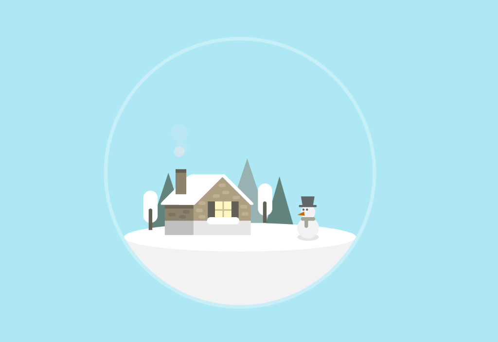
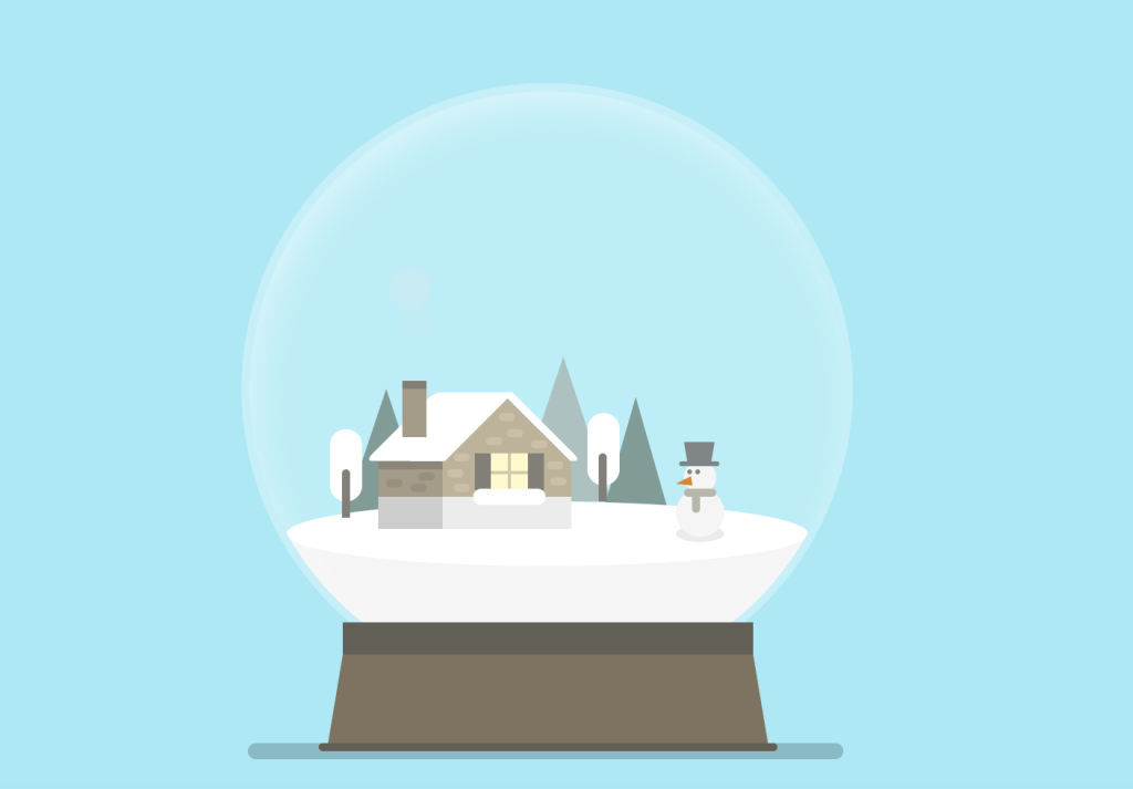
Pure CSS Snow Globe
CSS Christmas Tree