
To learn how to create the CSS Christmas Card/ Santa Claus – open to play, follow the steps below.
Demo:
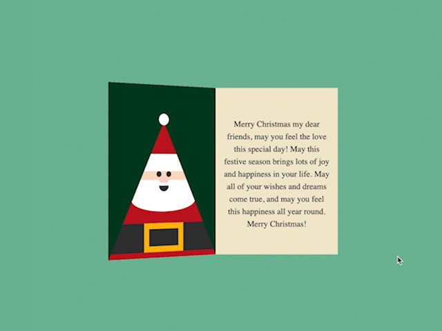
*to see the animation on the website, click here.
*music source: (free music) youtube audio library – Jingle Bells (by Jingle Punks).
Step1.
Add HTML
Use the <audio> and <source> tags to link the audio/ music.
  <div class="christmas-card">
             <audio id="player" name="jingle-bells">
  <source src="https://lenadesign.org/wp-content/uploads/2022/12/Jingle-Bells-Instrumental-Jingle-Punks.mp3" type="audio/mpeg"/></audio>

      <input id="open" type="checkbox">
      <label class="open" for="open"></label>
      <div class="card-front">
          <div class="santa-claus"></div>
          <div class="front"></div>
          <div class="pompon"></div>
      </div>
      <div class="card-inside">
      </div>
    </div>
Step2.
Add CSS
Set the position and colour of the background and elements:
        body {
            display: flex;
            justify-content: center;
            height: 100vh;
            overflow: hidden;
            align-items: center;
            background-color: #73ba9b;
        }
Style and animate the Christmas Card:
  .christmas-card {
            width:220px;
            height: 300px;
            position: relative;
            cursor: pointer;
            transform-style: preserve-3d;
	        transform: perspective(2000px);
            transition: .3s;
        }
                input#open {
            display: none;
}
        .card-front, .card-inside {
            width:100%;
            height: 100%;
            position: absolute;
            overflow: hidden;
        }
        .card-front {
            transform-origin: left;
            transition: .3s;
            box-shadow: inset 0 120px #c1121f,inset 0 150px #fff, inset 0 165px #f9dcc4,inset 0 200px #fff,inset 0 240px #c1121f, inset 0 290px #333, inset 0 300px #c1121f;
        }
        .card-front:before, .card-front:after {
            content:"";
            position: absolute;
        }
        .card-front:before {
            background-color: #333;
            width: 10px;
            height: 10px;
            border-radius: 50%;
            top:150px;
            left:95px;
            box-shadow: 20px 0 #333;
        }
        .card-front:after {
            background-color: #fcd5ce;
            width:20px;
            height: 10px;
            border-radius:50px;
            top: 160px;
            left: 100px;
        }

        .santa-claus {
            position: absolute;
            width: 60px;
            height: 30px;
            border: 10px solid #ffba08;
            top: 240px;
            left:70px;
        }
        .santa-claus:before, .santa-claus:after {
            content:"";
            position: absolute;
        }
        .santa-claus:after {
            background-color: #333;
            width: 20px;
            height: 10px;
            border-radius: 0 0 50px 50px;
            top:-75px;
            left:20px;
        }
        .santa-claus:before {
            background-color: white;
            border-radius: 50%;
            width:130px;
            height: 40px;
            top: -70px;
            left:-35px;
        }
        .front {
            position: absolute;
        }

        .front:before, .front:after {
            content:"";
            position: absolute;
            background-color: #003e1f;
            width: 350px;
            height: 350px;
            z-index:1;
        }

        .front:before {
            transform: rotate(-65deg);
            left:-268px;
            top:-90px;
        }
        .front:after {
            transform: rotate(65deg);
            left:138px;
            top:-90px;
        }

        .pompon {
            position: absolute;
            background-color: white;
            border-radius: 50%;
            width: 20px;
            height: 20px;
            top: 50px;
            left:100px;
            z-index:10;
        }

        .open {
  position: absolute;
  width:220px;
  height: 300px;
  left:0;
  top:0;
  background-color: transparent;
  z-index:6;
  cursor: pointer;
}

#open:checked ~ .card-front {
  transform: rotateY(-155deg);
}

.card-inside {
  background-color: #f2e8cf;
  z-index:-1;
}

.card-inside:before {
  content:"Merry Christmas my dear friends, may you feel the love this special day! May this festive season brings lots of joy and happiness in your life. May all of your wishes and dreams come true, and may you feel this happiness all year round. Merry Christmas!";
  position: absolute;
  font-size: 15px;
  text-align: center;
  top:40px;
  padding:15px;
  line-height:150%;
}
Step3.
Add JavaScript
let input = document.getElementById("open");
let audio = document.getElementById("player");

input.addEventListener("click", function(){
  if(audio.paused){
    audio.play();
    audio.currentTime = 0;
    input.innerHTML = "Pause";
  } else {
    audio.pause();
    input.innerHTML = "Play";
  }
});
Enjoy coding!
Hey, here’s something that might interest you:
CSS Christmas Card (Open/ Close on Click)
CSS Happy New Year Animation (fireworks)