
The CSS mix-blend-mode property defines how an element’s content should blend with its direct parent background.
Syntax:
mix-blend-mode: multiply|screen|overlay|darken|lighten|color-dodge|color-burn|difference|exclusion|hue|saturation|color|luminosity| normal;Demo:
multiply – sets the blending mode to multiply.
screen – sets the blending mode to screen.
overlay – sets the blending mode to overlay.
darken – sets the blending mode to darken.
lighten – sets the blending mode to lighten.
color-dodge – sets the blending mode to color-dodge.
color-burn – sets the blending mode to color-burn.
difference – sets the blending mode to difference.
exclusion – sets the blending mode to exclusion.
hue – sets the blending mode to hue.
saturation – sets the blending mode to saturation.
color – sets the blending mode to color.
luminosity – Sets the blending mode to luminosity.
normal (default) – sets the blending mode to normal.
Example1:
<!DOCTYPE html>
<html>
<head>
<meta name="viewport" content="width=device-width, initial-scale=1">
<style>
.example-container {
background-color: #2a9d8f;
padding: 10px;
}
.example-container img {
mix-blend-mode: lighten;
}
</style>
</head>
<body>
<div class="example-container">
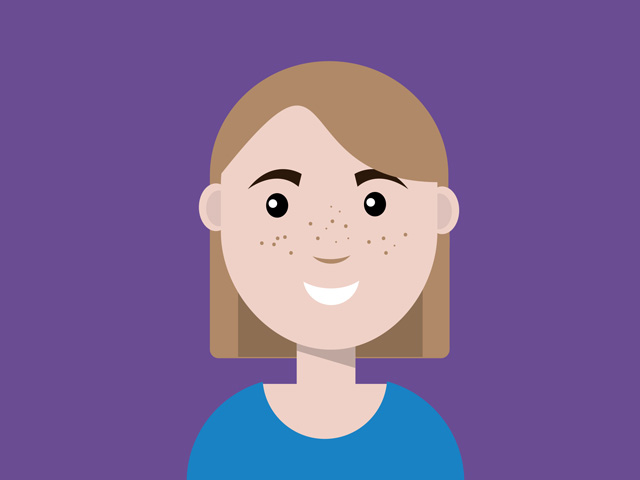
<img src="https://lenadesign.org/wp-content/uploads/2019/12/avatar.jpg" alt="avatar" width="320" height="240">
</div>
</body>
</html>Output:
Example2:
Using the CSS mix-blend-mode property you can create a responsive cutout text:
<!DOCTYPE html>
<html>
<head>
<meta name="viewport" content="width=device-width, initial-scale=1">
<style>
.cutout-container {
  background-image: url("https://lenadesign.org/wp-content/uploads/2021/07/cut-out.jpg");
  background-size: cover;
  position: relative;
  height: 480px;
  width: 640px;
}

.text {
  background-color: rgba(255,255,255,0.85);
  color: black;
  font-size: 100px;
  font-weight: bold;
  margin: 0 auto;
  padding: 5px;
  width: 70%;
  text-align: center;
  position: absolute;
  top: 50%;
  left: 50%;
  transform: translate(-50%, -50%);
  mix-blend-mode: screen;
}
</style>
</head>
<body>

<div class="cutout-container">
  <div class="text">Cutout Text</div>
</div>

</body>
</html>
Output:
Enjoy coding!
Read also:
CSS background-blend-mode Property